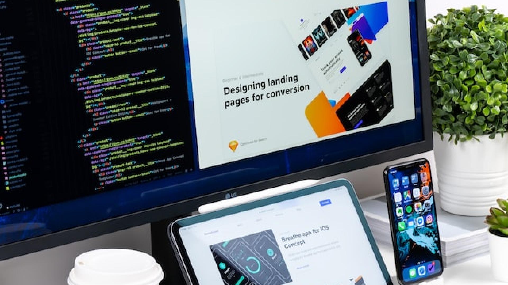
Drupal 10’s View Responsive Grids for Web Design

Having an online presence is notably a critical aspect of the business realm. Whether you are a service provider, small-scale business entrepreneur or even someone with an online portfolio showcasing your projects and skills, the way your site is displayed says a lot about who you are.
A well-received responsive web design makes your site all the more welcoming to your online audience and new users.

An easy flow of designs and a symmetrical grid adds to the aesthetic value, posing you as a classy and skilled individual.
A thorough and well-thought-out website is crucial; as trivial as it may sound, Drupal 10 includes a new feature to meet this requirement.
View Responsive Grids is a new feature in Drupal 10 that makes use of contemporary CSS capabilities, offering a unique plan to maintain a wide range of design variables.
ImageX put out an in-depth blog article explaining this feature and how you can build a better web page efficiently.

Note: The vision of this web portal is to help promote news and stories around the Drupal community and promote and celebrate the people and organizations in the community. We strive to create and distribute our content based on these content policy. If you see any omission/variation on this please let us know in the comments below and we will try to address the issue as best we can.
Related Organizations
Comments
You may also like