Component-Based Design Using Single Directory Components (SDC) in Drupal


The most recent versions of Drupal 10 core contain the experimental SDC (Single Directory Components) module. This module wants to bring Drupal front-end development closer to component-based design, a paradigm that in recent years has taken great strength (React, Vue, Web Components, Storybook, etc ...) but was not easy to implement in previous versions of Drupal core.
This guide is based on my talk at the last DrupalCamp in Seville. If you prefer the audio-visual format, you can watch the presentation here.

1) The road to SDC
Two major pressures have led to the creation of Single Directory Components (hereafter SDC).
On the one hand, an external pressure: in recent years, the world surrounding Drupal has clearly moved in favor of component-based design. We all know frameworks like React, Vue, Svelte; but also tools like Storybook, methodologies like Atomic Design or even venerable tools like Bootstrap have inaugurated or moved in this direction.
On the other hand, there is also internal pressure. As I mentioned in the talk I gave in Zaragoza in 2022, for some time now in Drupal there have been several modules and contributed themes that point in one way or another towards component-based design. Some of them are Single File Components, UI Patterns, Components!, Emulsify or Radix.
SDC comes to be the solidification and realization of an answer to these needs in an official Drupal Core proposal.
But before knowing the answer to a problem we have to ask ourselves: what is the problem?
1.1) The Drupal front-end development problem
Aside from the steep learning curve, a problem specific to the Drupal front-end is that the systems that interfere with the rendering of a page are widely distributed among different layers and places in the code.
At the end of the day, what a front-end developer needs to know is who is interfering with the HTML, CSS and JS that ends up in the browser.
In Drupal, on many occasions, there are too many layers interfering.

This makes it difficult for new Drupal developers to learn and can even be tricky for more advanced profiles. Context loss, unwanted overwrites and coupling occur all too easily.
This frustration will be familiar to many Drupal developers who have faced a difficult bug to hunt down: Is the problem in the templates? Which template takes precedence? What suggestions are being applied? At the module or theme level? Is there a library overwrite in the info.yml? Who declares the library? What if there is a hook that alters it? How many hooks are involved, and in what order
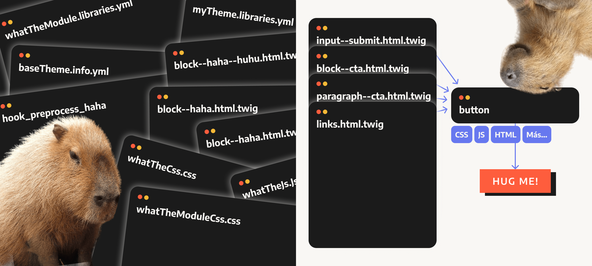
All the solutions that precede SDC have one thing in common and that is that they attempt to organize front-end development in Drupal based on component abstraction.
The goal is that each UI element potentially reusable and unique should be able to manage itself, that is, manage its own HTML, CSS, and JS and be invoked from other points of the code.
In this way, a first step is already achieved and we approach the single responsibility principle: everything concerning a given component must be handled in one place. Thus, any change or update made at the component level should be immediately shared by all instances that have been created throughout the project:
At this point, any developer will say: but this can already be done in Drupal! Just use any of the modules mentioned above (Components!, for example). This could be achieved even using capabilities that are already in Twig and Drupal Core.
So: what does SDC bring to the table?
Let's try to solve the question in three main sections:
1. How does SDC work?
2. What problems does it solve right now?
3. What problems it will help solve in the future?
2) How SDC works
You just need to use Drupal Core in version 10.1.x, activate the SDC module (experimental) and create a folder called components inside the module or theme where you want to add a component to start working with SDC.
| It is not mandatory but it is highly recommended to install the drupal/core-dev package to benefit from component validation. From a DX (developer experience) point of view, it is almost essential. |
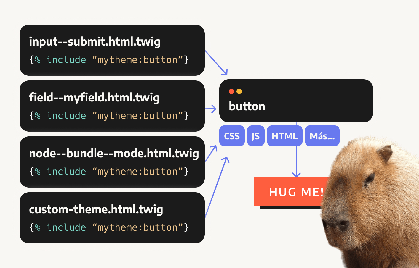
Inside the components folder, we will add a subdirectory for each component. Therefore, the first thing we can notice is that SDC opts for the strategy of organizing components in directories, as opposed to other strategies such as Single File Components, also present in Drupal and popularized by Vue.
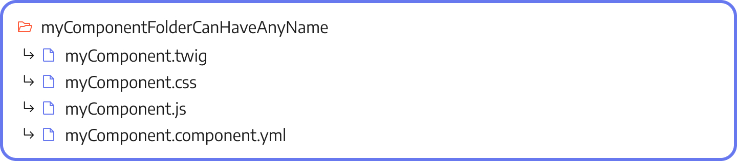
2.1) SDC can be extremely simple...
First of all, SDC is conceptually very simple: all assets must have the same name and be grouped under the same directory - which, by the way, does not have to follow the same convention.
| You may be wondering about that mysterious myComponent.component.yml. This file (more on that later) is of paramount importance as the component auto-discovery mechanism depends on it and it also includes many of the new features of SDC. |
In fact, a component could very well consist of a *.twig and a *.component.yml file, which are the only files required.
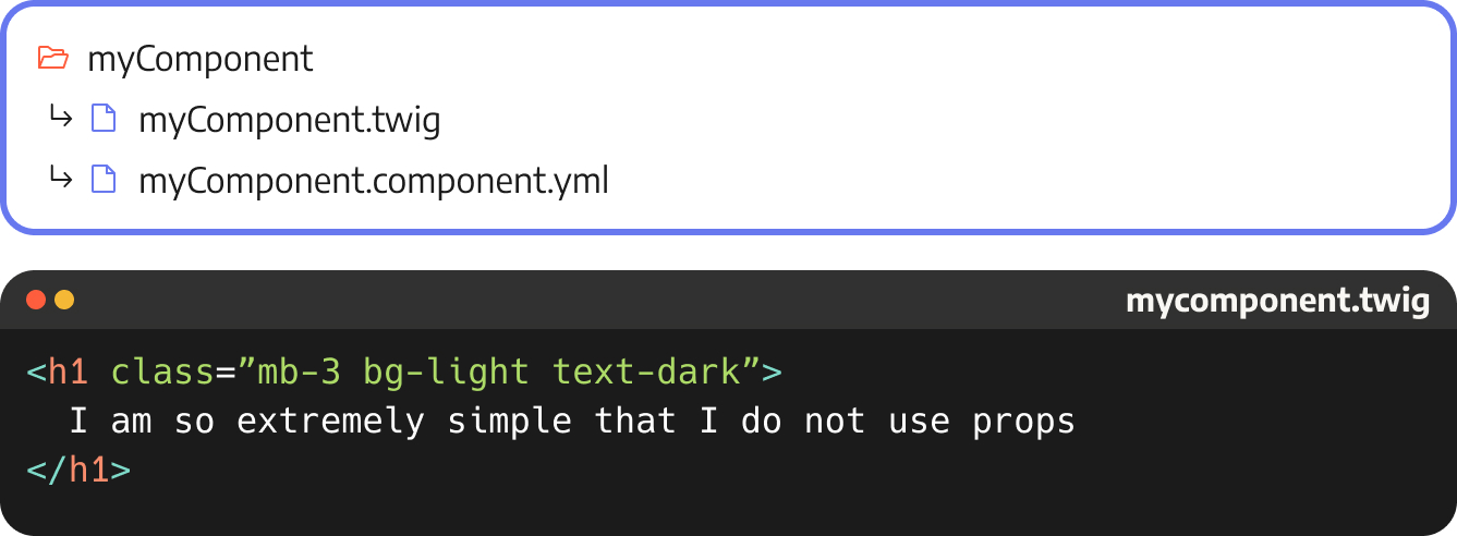
This simple implementation will already allow us to access the component with id mytheme:mycomponent.
| Components are identified not only by their name, but also by the module or theme that declares them, i.e. namespace:component. We will see uses for this later, such as overwriting components. |
2.2) ...or as complex as we want to make it.
Similarly, SDC can be as complex as we want to make it. The idea is that everything related to the component lives in the same directory: documentation, Storybook files, images, .scss or .ts files, dependencies in a package.json...
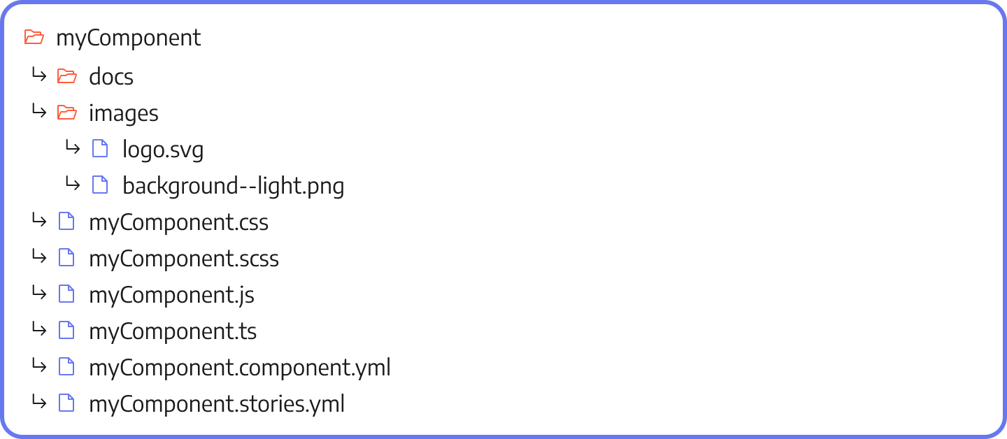
| Remember that components can be declared at both module and theme level. |
Library autogeneration
Just by using SDC in this way we have already obtained an advantage: the CSS and JS of the component will be added to the theme automatically, without the need to add a Drupal library.
That is, we can get rid of the attach_library('mytheme/mycomponent') and the $variables['#attached']['library][]. Fantastic!
This has positive performance and maintainability implications that we will see later.
2.3) The *.component.yml file
So far the only big news is that mysterious mycomponent.component.yml file about which we still know nothing.
The reality is that a large part of SDC's power resides in this file.
But, at the same time, and to facilitate the implementation of SDC, this file can be gradually incorporated into our components. Let's see the particularities of the *.component.yml starting from its minimal implementation.
An empty file
# I have nothing to say!To begin with, our mycomponent.component.yml can be empty. In fact, it is the minimum implementation needed to guarantee that our component will be discovered and registered in Drupal.
This is a great help when migrating to SDC: you can start with an empty definition and increase it little by little.
Component identification
name: Navbar
status: experimental
group: Navigation
The initial information about the component is its most basic metadata: name, status and group. We will see later what this data can be used for.
By the way: the component declaration uses the json-schema.org standard. This is why you will see certain particularities with respect to other Drupal schema and this is also why it is advisable to add a reference to the schema to help our IDEs provide help, autocompletion or error indication.
Adding the SDC schema is as easy as this:
$schema: https://git.drupalcode.org/project/sdc/-/raw/1.x/src/metadata.schema.json
name: Navbar
status: experimental
group: Navigation
Taking control of the library
We said before that one of the advantages of SDC is that it declares and loads the component library for us. That is, our CSS and JS are added automatically, without us having to do anything.
However, this is only valid for mycomponent.css and mycomponent.js files. What happens if we want to...
1. ...declare dependencies?
2. ...add more CSS / JS files?
3. ...use other names?
In that case, we can take control of the library by using the mycomponent.component.yml file.
name: Navbar
status: experimental
group: Navigation
libraryOverrides:
 css:
   theme:
     assets/css/theme.css : {} # We add an aditional CSS file
 dependencies: # We add dependencies to core libraries
   - core/drupal
- core/once| The values of *.mycomponent.yml will be merged with the auto-generated library, so there is no need to re-declare the mycomponent.(css|js) files here. |
Defining the schema of our component: props and slots
Time to get down to business: the most important thing about our component is the contract we sign with it.
In other words: SDC allows us to delimit and define precisely what values (inputs) it accepts and what its conditions are:
name: Navbar
props:
 type: object
 required: [type]
 properties:
   type:
     type: string
     description: Badge type
     enum: [primary, secondary, info, danger]
slots:
 content:
   title: Alert content
   description: The alert content.
In this example our Navbar component accepts a prop called type which is a string and accepts only three values: primary, secondary, info or danger. This type is required.
In addition, our component declares a slot called content.
Are we going too fast? Don't worry: before we continue, let's clarify what we mean by the concepts of prop and slot:
But... what the heck are props and slots ?
This conceptual difference does not come from Drupal, but has been borrowed from Vue.js and appears, in one way or another, in many libraries that use component-based design. If you want a more complete description, I recommend you to go to the official documentation.
Here we will make a brief and functional differentiation.
Props
The props are the values that a component can take, whose nature and structure is known in advance.
That is, the props belong to the world of the known, the controlled, the defined. Through them we define and allow us to modify the structure and behavior of the component.
Of the props we know, for example, its type (is it a text string? an array? a number?), as well as whether it is required or not and whether it has a limited number of possible values.
Slots
By their nature, props cannot render arbitrary HTML or other nested components.
This capability is reserved for slots, which declare zones where we have permission to take control of their rendering. That is: insert here whatever you want. That "whatever you want" is usually arbitrary HTML or nested components that we could not pass as props.
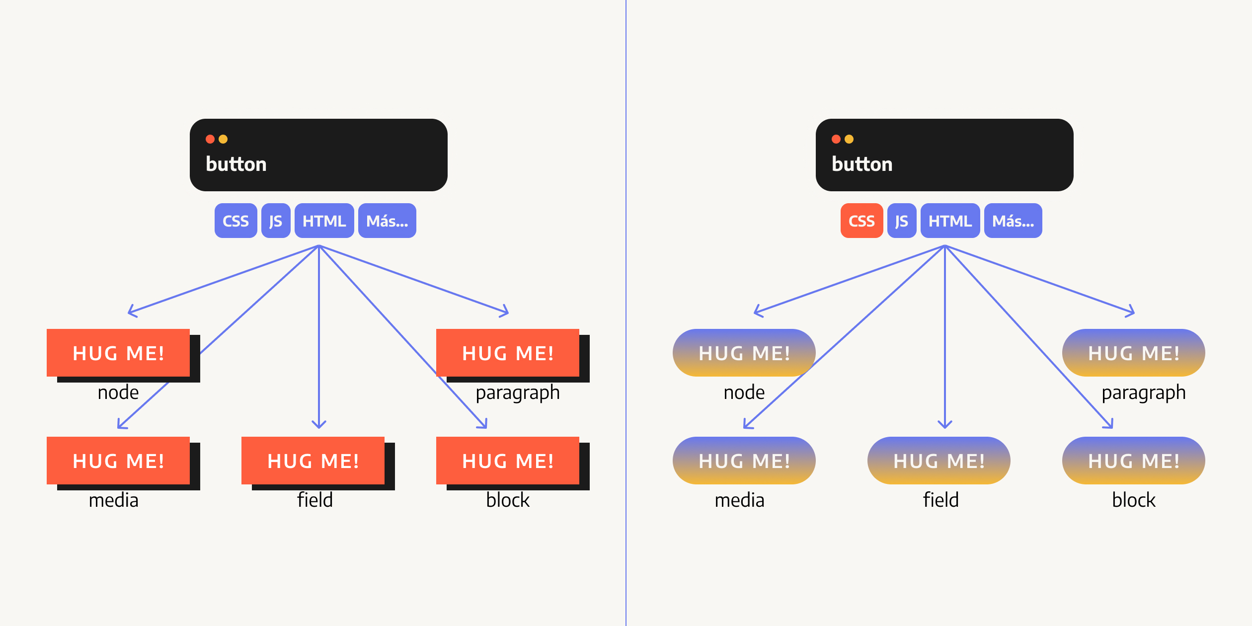
An example of props vs slots
Here is an illustrative example.
Given the following component (a kind of card), the elements marked in purple would be props and the orange element would be a slot
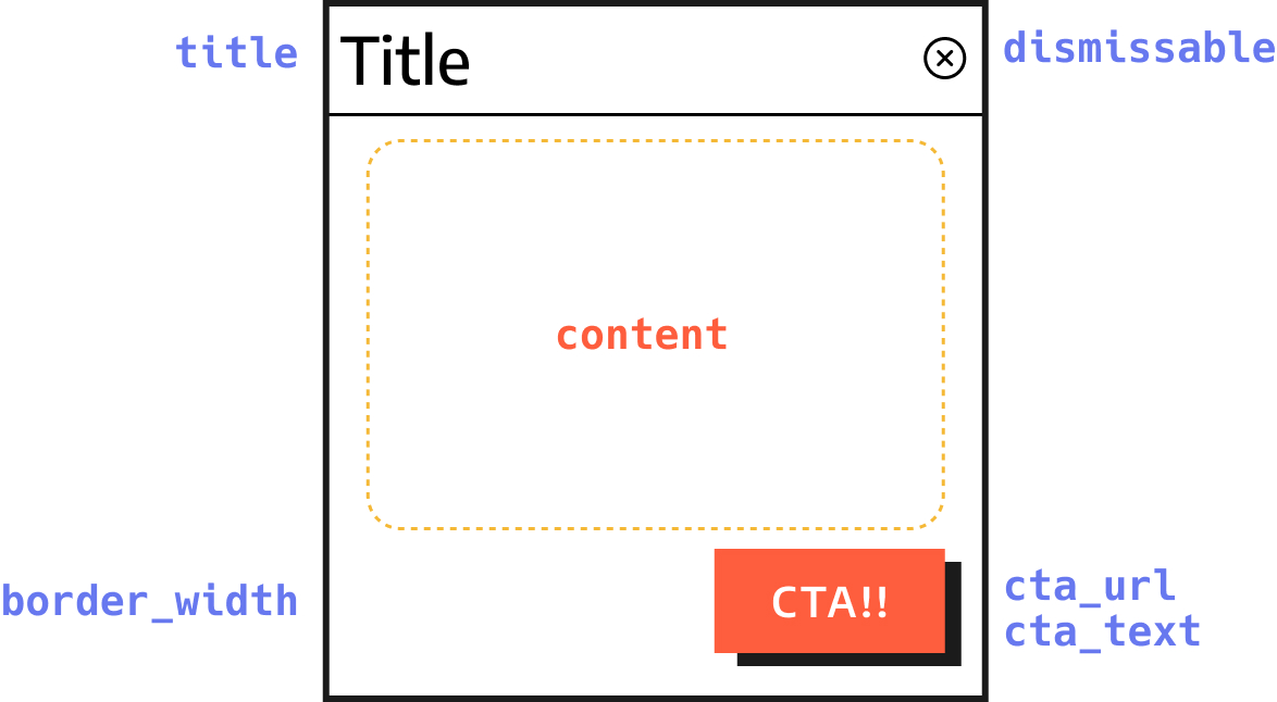
Props are distinguished because they are the ones that define the structure and variants of the component. In this case, we can easily imagine that:
- title is a string that will be rendered inside a heading or similar
- dismissable is a boolean that we will use to control whether the close button is rendered
- border_width is an integer that could take a value restricted to between 1 and 3
- cta_url and cta_text are two strings that we use to create a button (and that in turn could be another SDC component!).
However, in card-like components it is very normal that we do not know (nor should we know) what is going to be rendered inside the card. The area named content could host anything: plain text, text with HTML, images, other components...
That is why content is declared as a slot, an area of free use.
Defining props and slots in the *.component.yml file
Let's get to work: let's define our component. Let's start with the props, which could be something like this (let's consider the CTA as mandatory for simplicity):
(...)
props:
 type: object
 required: [title, cta_url, cta_text]
 properties:
   title:
     type: string
     description: Badge type
   dismissable:
     type: boolean
     default: false
   border_width:
     type: number
     default: 1
     enum: [1, 2, 3]
   cta_url:
     type: string
   cta_text:
     type: string
   attributes:
     type: Drupal\Core\Template\Attribute
We note the following:
- We have indicated that the mandatory props are title, cta_url and cta_text
- It is possible to indicate default values (default).
- It is possible to restrict the values using enum
- It is possible to indicate as type Drupal objects such as the well-known Attribute.
On the other hand, defining slots is much simpler since it is enough to indicate their existence:
slots:
 content:
   title: Card content
description: The card content.| Help! Too much information! I'm sorry! This part is the hardest, but you will soon start to see the benefits. However, don't be overwhelmed: you have at your disposal complete documentation about the *.component.yml file, including an annotated example and a component drush generate command. |
Overwriting of components
Finally, in the *.component.yml file is where the overwriting of components takes place:
name: Navbar
status: experimental
group: Navigation
props: {}
slots: {}
replaces: “mymodule:mycomponent”
In this case, we are indicating that we want to replace with our component the component with id mymodule:mycomponent (remember that a component is identified by its name and by the module or theme that declares it).
It is important to note that only themes can overwrite components, and that you can only overwrite components with the schema defined in mycomponent.component.yml.
Fork!
|
2.4) How to implement a component
This is all well and good, but it's time to comet down to earth: given a component with slots and props, how would we implement it in Drupal?
The answer is again simple: using tools you already know all too well: twig's {% include %} and {% embed %} and render arrays.
Let's start with a simple example: the Bootstrap badge component (see its documentation):
This is a badge!
A simple version of this component could be implemented in twig in this way:
{% set classes = [
   'badge',
   'text-bg-' ~ color,
]%}
<div class="{{ classes | join( )}}">
 {{ content }}
</div>| As you can see, this component does not contain any drupalism. No node.getLabel() or field_dismissable.value. It is not coupled to any particular implementation and is therefore easily reusable: in fact, we could use it outside of Drupal. Decoupling Drupal components as much as possible is one of the goals of SDC, and will help with reusability and even the generation of shared component libraries. |
From the above code it is easy to infer what their props are:
yamlprops:
 type: object
 required: [color, content]
 properties:
   content:
     type: string
   color:
     type: string
     enum: ['primary, 'secondary', 'light', 'dark']
   classes:
     type: array
The only special feature is that we have added an enum to limit the color options.
The only special feature is that we have added an enum to limit the color options.
Implementing this component in our code is as easy as using a {% include %} directly referencing the component by its ID mytheme:badge:
{% include "mytheme:badge" with {
 color: 'primary',
 content: 'This is a badge!',
 classes: [
   'additional-class'
 ]
} %}
Make the component more flexible
This component has a problem: we are assuming that content is always going to be a string, but what if the user wants to add, for example, a small icon?
<i class="fa fa-help"></i> This is a badge!Or, even add an icon that is another component itself:
{% include "mytheme:icon" with { icon: 'help' } %} This is a badge!With props we cannot, but we can declare a slot:
props:
 type: object
 required: [color]
 properties:
   color:
     type: string
     enum: ['primary, 'secondary', 'light', 'dark']
   classes:
     type: array

# We declare content as a slot:
slots:
 content:
   title: badge content
At the twig level, slots are implemented as a {% block %}:
{% set classes = [
   'badge',
   'bg-' ~ color,
]%}
<div{{ attributes.addClass(classes) }}>
 {% block content %}
   Put your content here...
 {% endblock %}
</div>
And we can incorporate them into our code by using {% embed %} and passing the props through with and the slots as blocks.
{% embed "mytheme:badge" with {
color: 'primary'
} only %}
{% block content %}
<i class="fa fa-help"></i>
<span>This is a badge!</span>
{% endblock %}
{% endembed %}Since we are using twig, we can benefit from the capabilities we already know. For example, within a block, nothing prevents us from nesting another component, which in turn could nest several others:
{% embed "mytheme:badge" with {
color: 'primary'
} only %}
{% block content %}
{# Embedded component #}
{% include "mytheme:icon" with {
icon: 'help'
} only %}
<span>This is a badge!</span>
{% endblock %}
{% endembed %}Implementation as rendering array
Finally, SDC components can also be implemented as render arrays, using the new component type:
$build['badge'] = [
 '#type' => 'component',
 '#component' => 'mytheme:bagde',
 '#props' => [
   'color' => 'primary',
 ],
 '#slots' => [
   'content' => [
     '#type' => 'html_tag',
     '#tag' => 'span',
     '#value' => t('This is a badge!'),
   ]
 ]
]
This use might not be so interesting for use in themes, but it can certainly be very interesting when it comes to developing contributed modules, field formatters, etc.
2.5) What about the component preprocessing hook?
At this point, and in view of the familiarity of it all, you may be expecting a hook_preprocess_mycomponent hook that allows you to alter and massage the props and slots that the component receives before it reaches the twig file.
The answer is that there are no preprocess hooks.
Why is that? You can read (and participate) in this issue, but we can cite the following reasons:
Alterations, data massaging, processing... will usually belong to an earlier point in time, since they are usually Drupal-specific. That is, if you have to handle the node object and its methods as node.get(field_name), you will usually be forced to do it in a step before the component intervenes, keeping the component decoupled from the particularities of Drupal and your project.
Any necessary logic that remains to be implemented at the component level can usually be taken to twig.
SDC is born with the idea of keeping everything needed to render a component inside a directory. Creating a hook would open the door for it to be invoked from a myriad of places, reintroducing the problem we are trying to get away from.
2.6) Ok, but... what's really new?
At this point someone could declare himself skeptical and say: you haven't answered my question, what's really new in SDC?
- As we said before, organizing components in directories is something you can already do with components! or even manually.
- Using {% include %} and {% embed %} to abstract and reuse components is not something from SDC, but from twig. We just added a convenient id namespace:component.
- Automatic loading of libraries is nice but:
-This is something already done by themes like Radix
-As we say in Spanish, complexity might exit by the door but enters through the window: we may not have to maintain *.libraries.yml anymore, but in return we have to take care of *.component.yml.
Let's try to answer by analyzing the problems that SDC solves today and, above all, those that it will be able to solve in the future:
3) The problems SDC solves today
3.1) A simpler mental model
The first obvious benefit of SDC is that organizing components into directories reduces the cognitive load and is an advance over a model in which there are a large number of layers and subsystems intervening at different levels and hindering reuse, the generation of shared standards and, in general, the work of the front-end developer.
3.2) Better performance by default (without relying on libraries.yml).
In my experience, there are two major models when it comes to handling CSS and JS assets in Drupal:
- Generate a giant bundle that includes all the site's CSS and JS. It's much faster, but it's a bad practice that results in loading a lot of unnecessary files and often leads to complaints from analytics tools, such as the dreaded Google's Lighthouse/Pagespeed Insights.
- Componentize everything and declare one library per component, actually following Drupal best practices. This is ideal, since libraries are only attached when they are invoked, but it introduces maintainability issues.
The reality is that Drupal clearly proposes model 2, but in many cases we still see model 1. We can find the reason on Drupal core itself: the libraries.yml file of the Olivero theme has a considerable size since each CSS component, even if it includes a simple CSSfind file, has to be treated as an independent library.
Too much work for such a banal task goes against the principle of maximum laziness (if there is no such principle, there should be).
SDC solves this by loading the libraries automatically, providing a pleasant developer experience from minute one: simply throw your files into a directory, use the component and you will receive only and exclusively the necessary css and js.
3.3) Validation, typing and useful errors
Another small big step forward for the Drupal front-end is typing, which allows us to finally have useful information about our errors or even prevent them before they happen. That is, SDC is also a tool against regressions and the dreaded WSOD.
Let's take the following twig code as an example:
{% if anArray | length > 5 %}
 {% set first = anArray | first %}
 {% for item in array %}
   {{ item }}
 {% endfor %}
{% endif %}
As we can see, it operates using array filters and for loops on the variable anArray. But... what happens if we pass a value that is not an array?
{% include “@theme/mycomponent.twig”
 with {
   anArray: 3
 }
%}
The answer is... nothing. And here's the problem: instead of an error, since twig is a permissive language 3 | length evaluates to 1. This empty rendering is a silent error that can be deployed without anyone noticing until it's too late.
However, if we use SDC and declare the type of the prop in mycomponent.component.yml
properties:
 anArray:
   type: array
   title: This is an Array
...any wrong type will throw not only an error or exception, but also a , this is, with concrete and precise information about the origin of the problem and its solution.
In this case: DrupalException InvalidComponentException: [anArray] Integer value found, but an array or an object is required.
3.4) Mandatory and enumerable props
The validation party doesn't end here: since props can be flagged as mandatory and can have enums, we get extra protection when it comes to preventing a component from receiving an insufficient number of values — or values that we can't handle.
A potentially dangerous example is the following: a component of type button that allows defining the HTML tag of the component in its prop tag: <button> or <a>:
<{{ tag }}{{ attributes.addClass(button_classes) }}>
 {{ content }}
</{{ tag }}>
This component has a serious problem: without SDC, forgetting the tag would result in malformed HTML which, in the absence of an html tag, would be rendered as plain text:
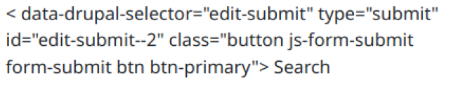
If we had indicated that tag is a required value using SDC, we would have gotten a useful error instead: [tag] The property tag is required.
Even with SDC, it is still possible to pass an unacceptable value to tag. For example: parachute. This error is even worse since twig will happily render the string as an HTML tag and browsers will not report any problems. Until the source code is analyzed, the bug may remain hidden for years:
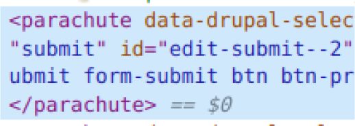
However, it would be enough to indicate an enum to obtain, again, a useful warning: [tag] Does not have a value in the enumeration ["button", "a"].
And all this with two lines of code in the mycomponent.component.yml:
props:
 type: object
 required:
   - tag # <------------------- Marks the tag as required
 properties:
   tag:
     type: string
     title: Tag
     default: 'button'
     enum: ['button', 'a'] # <- Whitelist the possible options
4) The problems it will solve: SDC's future
Perhaps the most exciting thing about SDC is what's to come.
In my opinion, the Drupal front-end community has embraced SDC with particular enthusiasm, and the proof of this is that multiple integrations are already underway, even though the module is still on its way to Beta.
We are going to review some of the integrations already in place / under development and the paths they are pointing towards, but before that we have to talk about a fundamental aspect of SDC that we have left for the end.
4.1) The silent revolution: every component is a plugin
Just as it sounds: every component is, internally in Drupal, a plugin.
One of the most revolutionary aspects of SDC stems from something as simple as this.
It means that we have a pluginManager service that we can use. It means that we can easily list all existing components, parse their metadata, modify them, access their schema. It means that the SDC system itself can be altered, extended, modified by other modules.
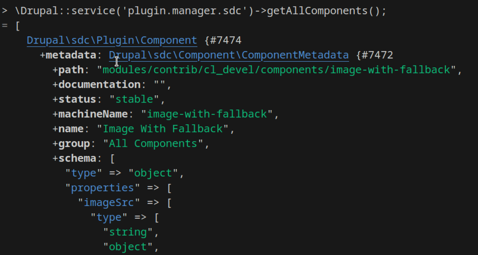
It means, above all, that SDC bridges the gap between Drupal's front-end and back-end. A bridge that was sorely needed.
Until now, most architectural decisions in the Drupal front-end were invisible to the back-end. For example, the fact that the view_mode named teaser was rendered by the card.twig component and styled by the card.css file; that it accepted certain values and was reused at one point and overwritten at another was something that was only in the developer's head.
With SDC, this stops. And it has immediate consequences.
4.2) Direct mapping of entities to components
A classic problem of all attempts to componentize the Drupal front-end is that, in the end, you always have to rely on a template as an intermediary.
That is, no matter how much you abstract your component in a mycomponent.twig, it always has to be invoked from a template, which after all is what Drupal knows and handles.
SDC does not solve this, since the system of theme hooks and suggestions remains unchanged. The result is a certain amount of repetition:
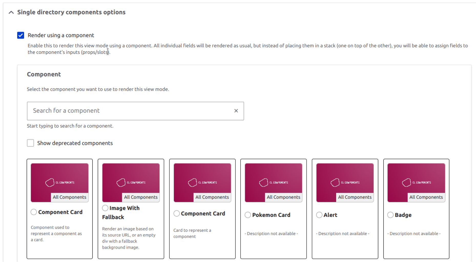
However, using the Single Directory Components: Display module it is indeed possible to map directly from Drupal (view modes, fields) to components.
That is, it is possible to skip the template as an intermediary and choose directly which component should be in charge of rendering a view mode or field directly from the user interface:
This may sound familiar to some of you: it is something that was popularized by the UI Patterns module back in the day. Good news for you: the 2.0.x branch of UI Patterns will use SDC as a base, instead of its own system. A happy convergence.
| The power of plugins We said before that the fact that components are plugins is a revolution, and here we can see an example: the SDC Display module can list all components, access their metadata (name, description) and know their props and slots. |
Easier still? Auto-generated blocks from SDC components
Could the developer experience be even better? Of course! We could have Drupal blocks that are automatically generated from components.
Since the *.component.yml file already contains all the information about the props and slots that a component takes, it is possible to generate blocks on the fly:
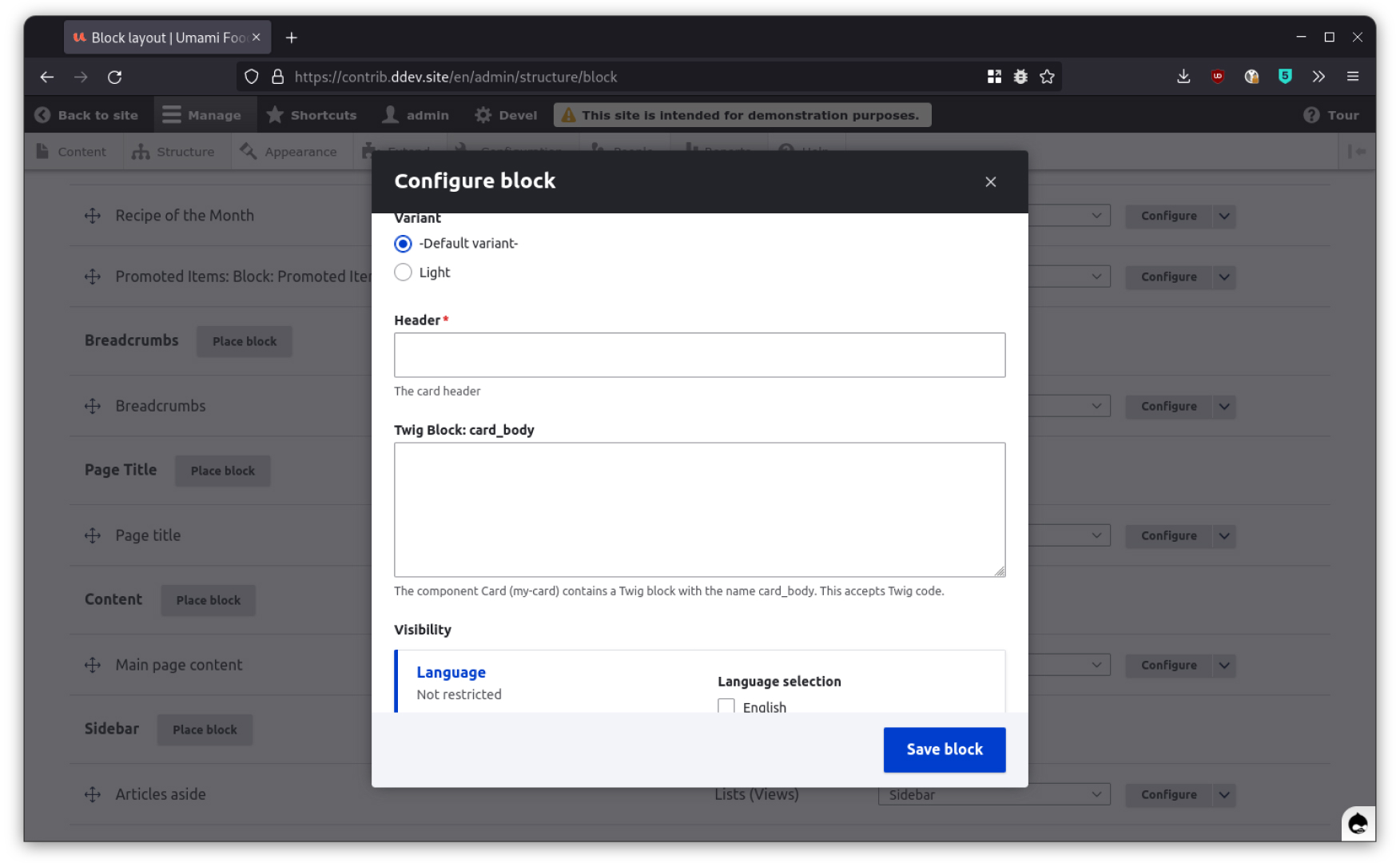
This is what the CL Blocks module does, a module prepared for the predecessor of SDC (Component Libraries), which is not yet compatible with SDC but is on its way to being so.
These blocks can be used, for example, in Layout Builder. Its form is generated from the information present in the *.component.yml itself (for example, a prop of type number will result in a form field of type <input type="number">.
Revolutionizing the Drupal Workflow
In any case, be it through manual component mapping, auto-generated blocks or any other future solution, SDC brings Drupal closer to a much simpler workflow whereby the developer will automatically get tools to use their components from the Drupal administration interface without any additional step.
4.3) Storybook integration: tests and self-documentation
Another existing integration for Drupal and SDC is Storybook, through CL Server and the associated Storybook plugin.
CL Server activates an endpoint in Drupal that can be accessed by a Storybook instance configured for it.
The setup takes some complexity, but the result is a style guide / documentation / live testing tool that is capable of displaying all the components registered in Drupal.
Why CL Server?A classic problem with Drupal / Storybook integrations is that they use twig.js to render twig. Twig.js does not have feature parity with ol' php twig, so it is not reliable: discrepancies may arise, tests may yield false positives / negatives or there may be visual differences. CL Server renders the components using Drupal itself, so the rendering in Storybook and Drupal are guaranteed to be identical because... they are identical. |
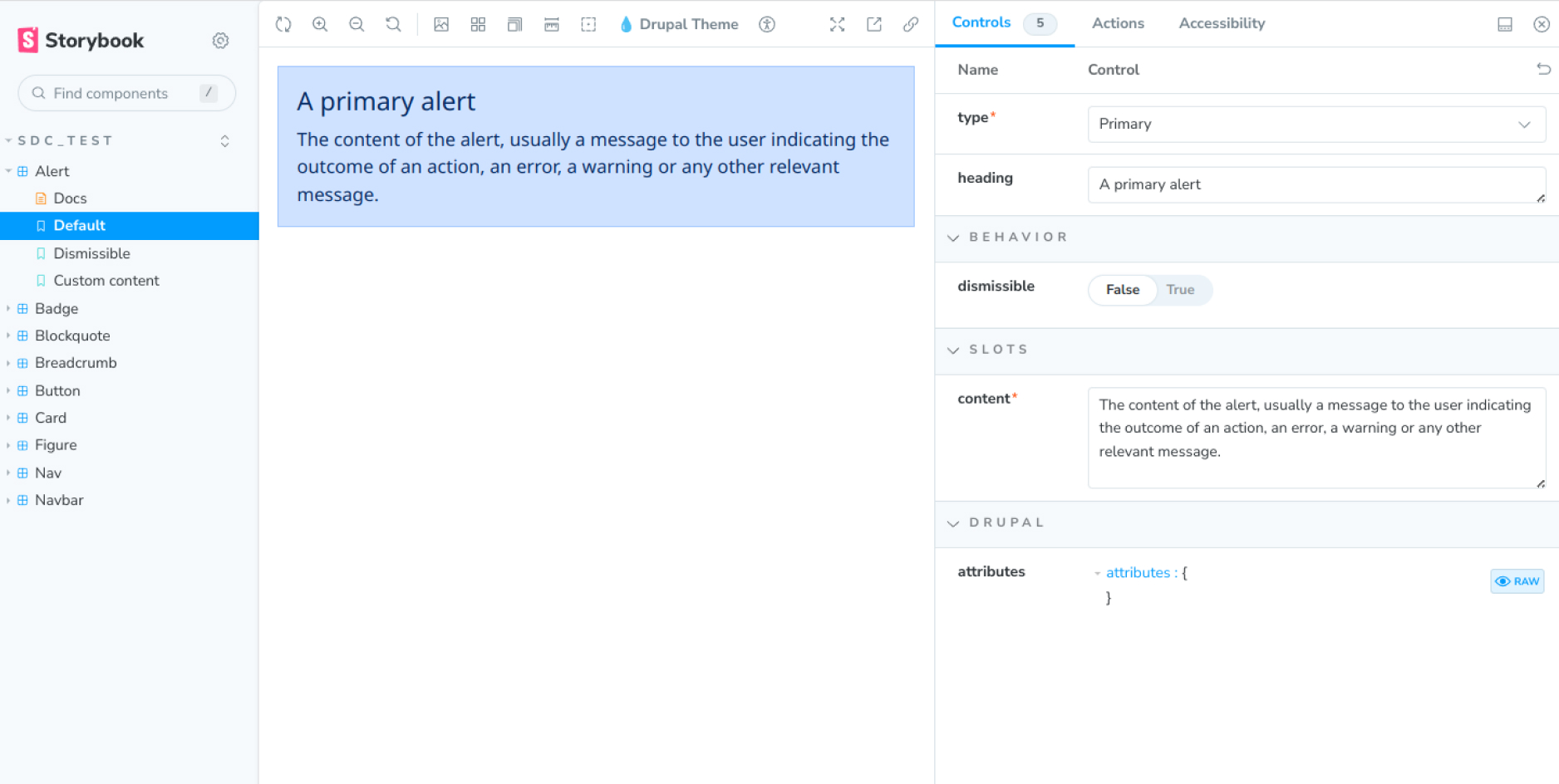
Storybook is a very powerful tool that goes far beyond a live style guide. For example, Storybook is able to run tests on components. In this screenshot, for example, we can see an accessibility test:
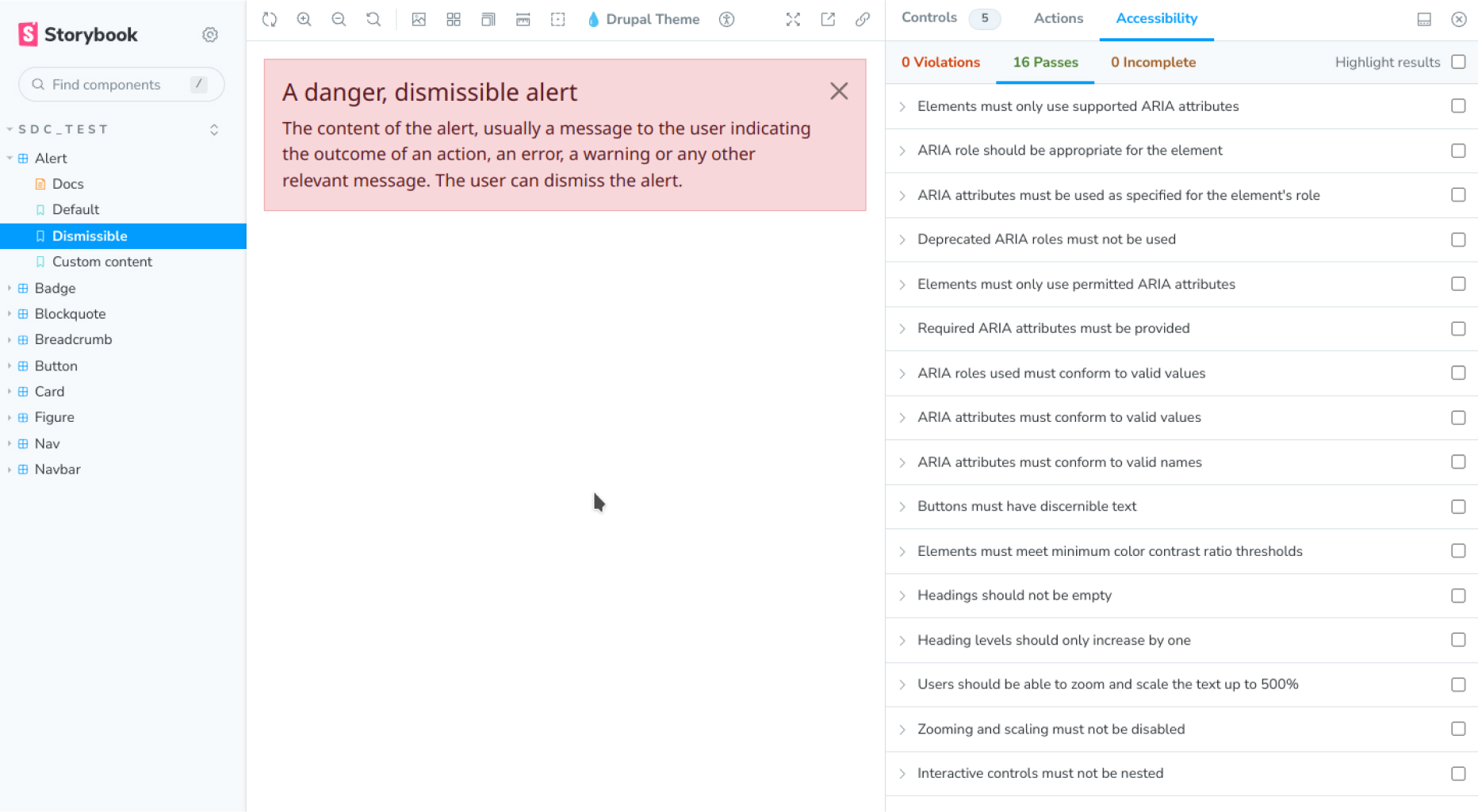
A central concept of Storybook are the stories, being each story a state of a given component. In the image above, for example, we can see the story of the alert component in dismissible mode.
It is easy to identify, at the testing level, the stories with scenarios.
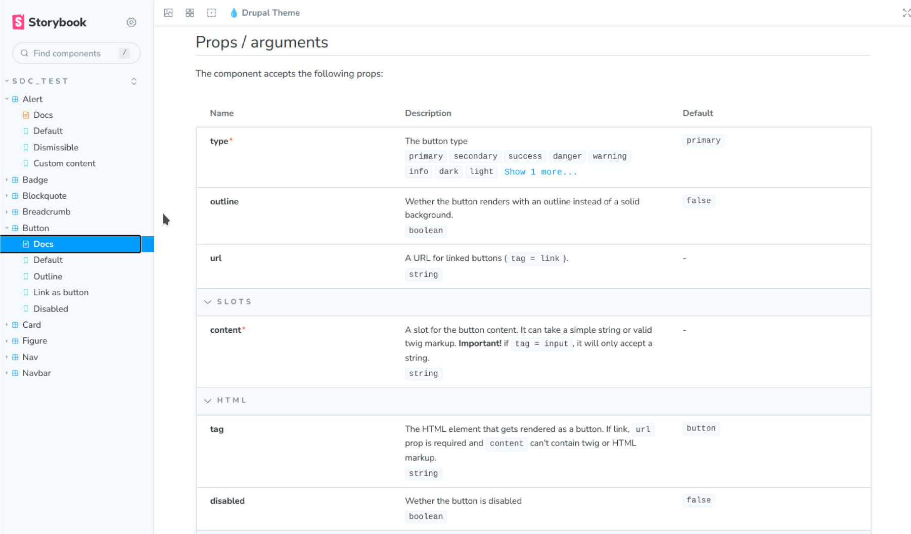
Another advantage of using Storybook is that the component can self-document from information present in its own directory. Storybook is able to create a page with all the information presented in a concise and orderly manner, including the component's props and slots, the README and other sources (even the source code itself!).
Attention! There is a Drupal generator (disclaimer: I wrote it) that converts *.component.yml files to *.stories.yml automatically. There you can also see the differences between the two formats. |
This is one of the integrations that have interested me the most, so I may soon write an extension to this article explaining how to make an integration as complete as possible between SDC and Storybook.
4.4) And there's more...
WebComponent Integration
The Pokemon Card module shows how easy it can be to integrate a WebComponent into SDC, opening the door to generating or integrating WebComponent libraries along with other tools such as SDC Display.
One of the most interesting things is how close the development experience becomes to React or Vue.
Integrating Pokemon Card is as easy as requiring the dependency (composer require), writing the following code...
{% include "pokemon_card:pokemon_card with {
 name: "Gengar"
}%}
...and voila! A perfectly rendered component that is even able to self-manage its connection to the external API from which it draws data.
How different is this experience for the developer from what we are used to seeing in React and company? The distances are getting shorter.
<Pokemon name="Gengar" />WebProfiler and CL Devel
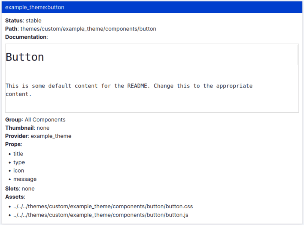
The WebProfiler module has already added support for components, including a small documentation of each component. Similarly, CL Devel is able to generate also a self-documentation of components based on their metadata.
Generators
To reduce the friction when generating components and their files (especially the *.component.yml) there are already at least three generators that provide drush commands:
- CL Generator, for components. If you use Drush 12, the generator is already built in.
- SDC Story Generator, for component-based Storybook stories
- SDC Web Components Generator, for WebComponents
...and more to come.
Integration with UI Patterns, the SDC Styleguide module providing a Storybook-like experience but in Drupal, Core themes using SDC... the Drupal community has welcomed SDC with open arms and the initiatives are multiplying.
5) In a nutshell
Single Directory Components is a great addition to Drupal front-end development. Part of its power lies in its simplicity and another part in the huge scope that some of its changes entail, specially the fact that the components are plugins.
We can say that SDC does all of the following:
- Brings Drupal closer to front-end best practices.
- Simplifies and eliminates repetitive tasks.
- It is easy to implement, can be implemented gradually and is not a "refactor" of Drupal's rendering layer but an add-on.
- Bridges the gap between front-end and back-end, something that was badly needed.
- Adds layers of security to front-end development.
- It will allow the development of better developer-focused tools.
- It will allow easier workflows for site-builders.


Note: The vision of this web portal is to help promote news and stories around the Drupal community and promote and celebrate the people and organizations in the community. We strive to create and distribute our content based on these content policy. If you see any omission/variation on this please let us know in the comments below and we will try to address the issue as best we can.
Related People


Comments
You may also like